Premise onboarding: Collecting demographic data while designing an intuitive experience
Company
Premise combines the power of a global network of on-the-ground contributors (mobile users) with industry-leading data science and machine learning to offer trustworthy insights to companies and organizations such as the Bill & Melinda Gates Foundation, USAID, Google, and The World Bank.
Problem
Only 30% of users who create an account and onboard with Premise complete the demographics survey within 30 days. This hurts Premise’s ability to target tasks to users based on demographics.
Business Goal
80% completion rate of demographics survey within 30 days.
Design Goals
-
Seamlessly incorporate the demographics survey in the user onboarding XP
-
Build trust with contributors by applying transparent communication to the use of contributors' data
-
Improve the consistency and reliability of demographic information collected from contributors
-
Build a scalable solution that sets the foundation for all our surveys
Before diving into the design process, let’s take a look at the current experience:
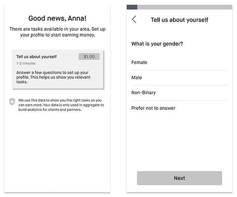
Current Demographics Survey
The issue here is that users don’t complete the demographics survey early after onboarding. Also, because the survey is not productized, it’s manually created by task creators. This limits our content and targeting capabilities.

Design Process
1. Low-Fidelity Mocks
Coming from the design studio and initial paper sketches, I first worked on low-fidelity mocks. To do that, I drew a plan of how I would tackle the problem based on assumptions I had at this point.
Assumptions 🔮
-
The demographics survey is long and users might drop out during onboarding
-
Users don’t feel comfortable sharing personal information
-
Contributors care about their earnings above all else
Strategy: Gamify the experience 🤺
-
Don’t overwhelm: Split the demographics survey into multiple sets of questions
-
Delight and encourage: Personalize the experience and create badges to indicate progress
-
Reward: Unlock tasks in the marketplace based on their profile progress

2. High-Fidelity Mocks
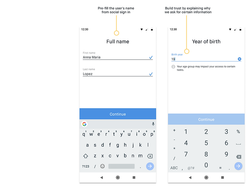
After multiple rounds of design critiques and stakeholder meetings, I put together the high-fidelity mocks, which would be then prototyped and tested with users. My initial assumptions still stood at this point, but the strategy was refined. We decided to simplify this experience and focus on improvements to the demographics survey. At this point, we also had a clearer understanding of the actual survey content.
Strategy 🤺
-
Improve Usability: Introduce the search feature and personalize the survey content according to the user’s location
-
Clarity: Refine the survey UI, with a focus on better/clearer selection inputs
-
Don’t overwhelm: Split the demographics survey into 2 sets of questions (instead of multiple)
Better Survey Design
Premise currently operates in 75+ countries and the app is localized to 38 languages. It’s crucial to design experiences that can accommodate different languages and cultures. The new demographics survey introduced big challenges, the main one being the amount of content.

To tackle this, we came up with two key solutions:
Top 10 Lists 🎯
Users in Uganda shouldn’t be seeing the same demographic facets as users in the Philippines. To improve the user experience in the long lists, we decided to tailor the first 10 options seen by users based on their country. If done correctly, the Top 10 lists can remove the need for most users to browse the universal lists or to use search.
Search 🔍
The long lists (Countries, Religions, Ethnicities, and Languages) have a search box to make it easier for users to find information. As the user types, we return suggestions from our universal lists, so they don’t need to scroll through hundreds of options. We believe that if users can easily find what they’re looking for, they will provide accurate answers.
New User Interface: Demographics Survey


3. User Testing
Participants 🙋🏽♀️🙋🏻♂️
-
8 Country Support Specialists (CSSs) from Lithuania, Uganda, Mexico, Jordan, Tanzania, Thailand, Vietnam, and the Dominican Republic.
-
All CSSs speak English (second language)
Constraints 👀
-
Prototype limitations: the Top 10 lists weren’t adapted to the participants’ countries and they wouldn’t be able to use the search freely.
-
English is not the participants’ first language, which made certain parts of the testing a little more challenging
Strategy 🧠
-
Guide participants during testing: they were requested to answer the questions by looking for specific religions, ethnicities, and languages—as opposed to answering freely.
Main Insights
The good stuff 🥇
-
Most users decided to complete their profile all at once when given the option
-
Most users described the onboarding experience as easy and clear
-
All users valued having more information about data use and payments
Needs more work 🖍
✖️ Users had difficulty finding the answers when not shown on the top 10 list
-
The content wasn’t tailored to the users’ location
-
Most users opted for scrolling down the lists instead of using the search box. Participants weren't comfortable typing in English (their second language)
-
“See all options”, which would take them to the universal list, was not easily noticed

✖️ Users were excited about their earnings but confused by the progress callout
-
The progress callout interrupted the user flow. Users were surprised and annoyed.

User Testing: Summary 🗒
-
Users had a hard time finding information: content wasn’t personalized to their location; they weren’t looking for their own demographic information; language barriers.
-
Interrupting the survey progress in the middle wasn't a great experience for users
4. Final Iteration
-
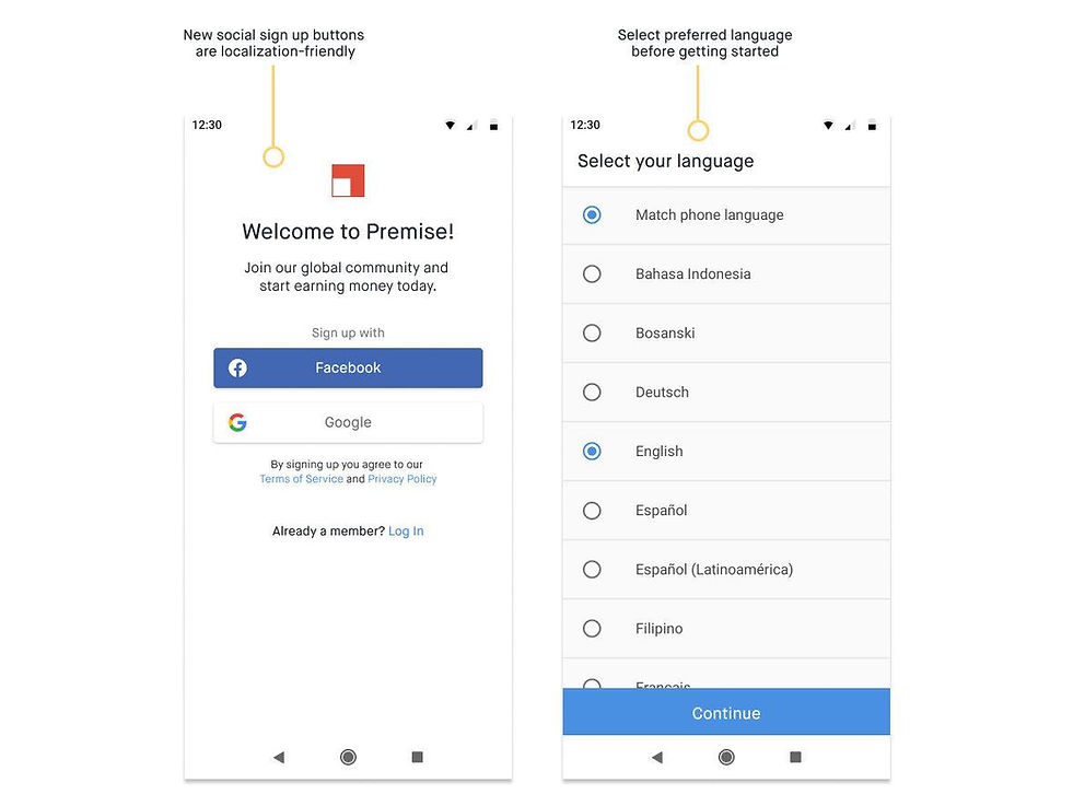
Language: Introduced the language screen to the onboarding flow
-
No interruption: Removed the progress callout and made one continuous flow
-
Content customized by country: Kept the Top 10 lists for religions, ethnicities, and languages
-
Search functionality: Quickly find information in long lists
-
Refined copy and illustrations


5. Final User Testing
Participants 🙋🏽♀️🙋🏻♂️
-
8 participants from different parts of the United States
-
6 participants from Kenya, the Philippines, UK, and Brazil
-
Participants from various age groups and backgrounds
Strategy 🤺
-
We used a real QA build to test for usability issues
-
Users went through the onboarding experience freely, with little interference from the moderator
Main Insights
The good stuff 🥇
-
No usability issues—all participants were able to complete the onboarding experience
-
Participants went through the demographic survey super fast (average of 2 min!). Users didn’t think the questionnaire was too long or were sensitive about the information requested
Needs more work 🖍
-
Most users found the financial question a little time-consuming. Users were expecting salary buckets as opposed to statements
-
Most users found their first marketplace experience a little vague and/or confusing
Note: No design work has yet been done in the marketplace experience. We let users experience the marketplace to gather insights for future improvements. Most users didn't understand the difference between the three types of tasks in the marketplace or how they would receive new tasks in the future.
User Testing: Summary 🗒
-
Overall, users didn’t have issues with finding their responses in the demographics survey
-
Most participants found their answers in the Top 10 lists
-
They used the search feature when needed
-
Users completed the demographics survey much faster than expected, with no blockers
-
More work is needed to better integrate the marketplace experience with the new onboarding flow.
Impact
The onboarding completion rate reached 98% and the overall conversion rate—the first task completed—went from 33% to 50%.
Final Experience
Challenges and Learnings
Stakeholders buy-in 🚦
As soon as I had the first prototype done, I did demos of the experience with every team in the company. One of the most challenging parts of this phase was to incorporate the feedback received while also considering our assumptions and pursuing the strategy we had laid out. During this whole process, I strived to find the balance between delivering a good user experience and fulfilling our business needs.
Like at the beginning of any design process, you can't be certain whether or not your ideas will solve the problem in question. What you can do is be open for feedback while maintaining your focus to understand if and when you need to shift gears and adopt a different strategy.
Testing, testing, testing…📋
Only through testing, we were able to understand the importance of personalizing this experience to our users’ location—and cultural background. Testing also confirmed our hypothesis that the survey wasn’t necessarily a long, tedious experience. Users were able to quickly find what they were looking for to accomplish their goals. Testing early and often was key to uncovering user needs at the right time.
Implementation is negotiation 🤝
The new onboarding experience brought implementation challenges to our small engineering team due to the introduction of new features such as the optimization of content based on location. There were outstanding issues on the data engineering side, as well as UI improvements in the mobile app. The size of this project along with limited engineering resources put a lot of pressure on this team’s members, which made it more challenging to negotiate the scope.
Despite the challenging negotiations and uncertainties, everyone on the team strived to deliver a great user experience. As a cross-functional team, we were able to work together to bring down the scope while delivering an experience that is scalable and will be used as the foundation for all of our surveys moving forward.
What guidelines? 🤹🏼♀️
In a startup like Premise, designers need to be able to apply a wide range of design skills across different projects. Along with designing the new onboarding experience, I initiated the work to define our mobile design guidelines. This involved brand workshops and a lot of experimentation on my side with colors, illustration styles, as well as tone and voice.